Austin Public Library Branding Project
These designs were created as part of a project I did in one of my graphic design classes. Our task was to choose a branch of the Austin Public Library, study it, and rebrand it while still keeping the values and vibes that are already in place.
I chose the Howson branch, which is a quiet location of the Austin Public Library located in Tarrytown.
The Wordmark
Typography

The Mural
I decided that along with the branding elements—such as the wordmark, logo, and color palette—the Howson library needed something more. As I spent time at the library and interviewed employees and users, I began to realize that this library was not getting the love it should be. With many schools nearby, and centered in a neighborhood filled with young children, I wondered why this library went so unnoticed. I came to the conclusion that the outside of the building was plain, and may seem unexciting to people passing by. That’s why I came up with creating a mural for the Howson Branch.
My main goals were to…
Attract families to the library with it’s playful feel. As families drive by the branch, they will quickly understand how Howson could fit into their children’s lives.
Brighten the overall feel of the branch. Without the mural, the library is plain and mundane.
Communicate the values of the branch, such as community, inclusivity, nature, and of course the love of reading.
Wordmark and Co-branded wordmark

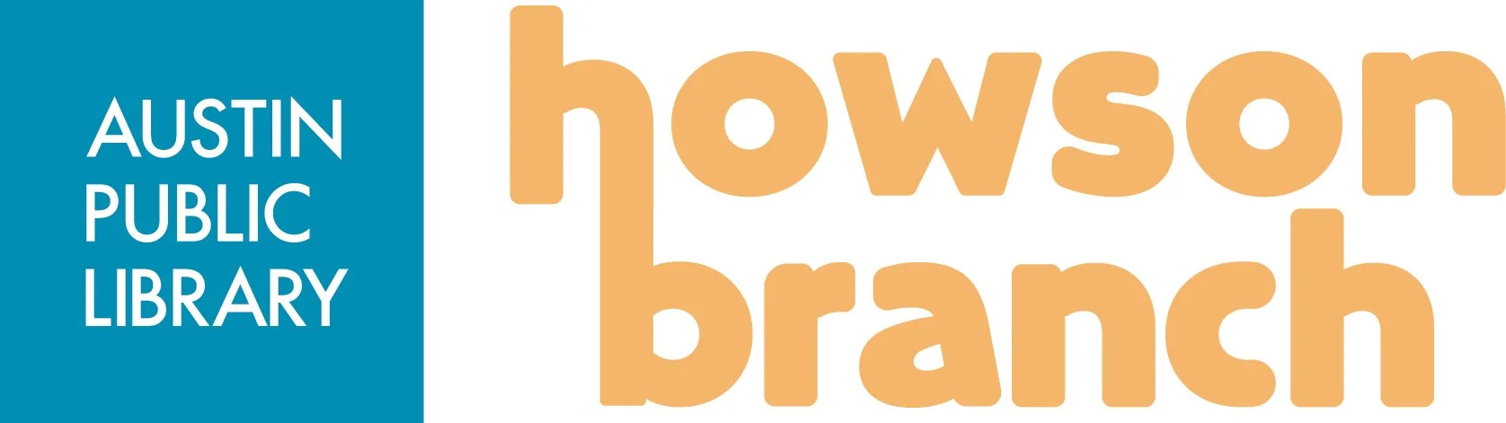
The Howson word mark embodies simplicity. It strives to foster a welcoming community for all. The selected font achieves a blend of sophistication and approachability, emitting a friendly and inviting atmosphere.
The bond between the "H" in Howson and the "B" in branch alludes to the cozy community vibe that defines Howson Branch Library's core values.
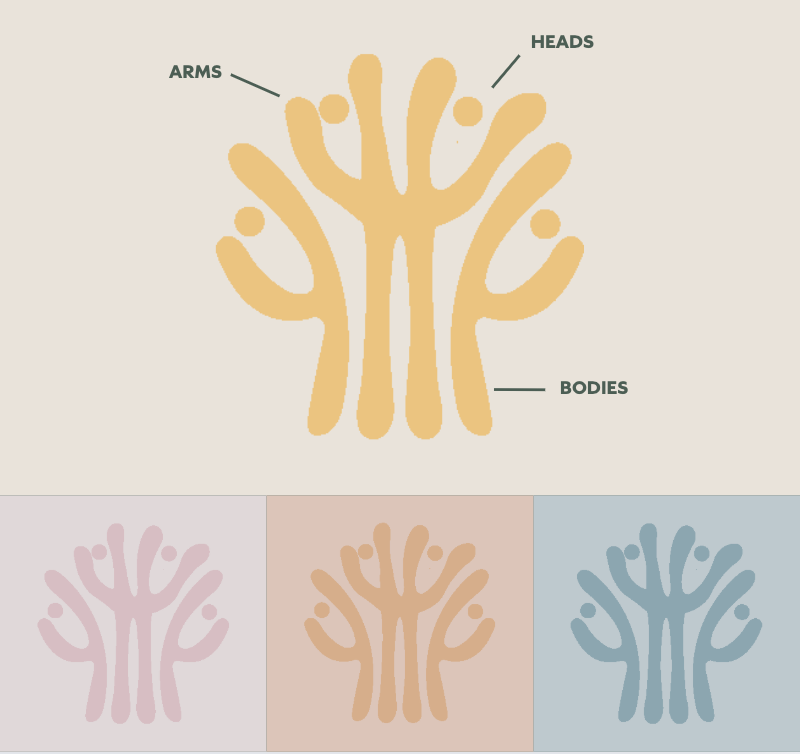
This logo resembles a tree made of people, where individuals bodies and arms create a strong trunk and leafy branches. It symbolizes Howson's affection for nature and close-knit community spirit.
The Logo
For the primary typeface we modified the Queens Sans Extra Bold giving the edges softer curves to further push the values of inclusivity and comfort
For the supporting typefaces, I decided to keep it consistent with Queens Sans as the differentiation between the weights are cohesive.

